
Features page 1 | Features page 2 | Opinion | Reviews | Brick By Brick | Speak To Me
Featured Images | Gilmour, Guitars & Gear | KAOS Theories | Trivia | Puzzles| Humor
Magnets and Miracles
An interview with photographer Rupert Truman
Spare Bricks is very pleased to present this exclusive interview with Rupert Truman, who has become Storm Thorgerson's primary photographer in recent years. He has worked with Storm on a variety of Floyd projects, and was kind enough to share his memories of those experiences with our readers.
Spare Bricks: How did you become interested in photography?
Rupert Truman: I think I first had an interest in photography as my father had a darkroom, and used to develop and print his own black & white images. I had a darkroom of my own in my teens where I produced horrible gloomy, flat prints for years. That was part of my training I guess--I learned to look at an image, its graphic shapes and so on. If you are looking at the same image all day, trying to get a decent print out of it, you can't help but think about it.
All through my late teens, I took photography seriously. Various friends kept telling me I should do it for a living, but I couldn't really see how. When I left school, I decided I wanted to make money and went and got a job in an international bank as a clerk. I decided within a month that if this was what office life was like, it wasn't for me. I quit, got some more qualifications, and went on to do a degree in Geology. After a few more years in offices (you would have thought I would have remembered the earlier experiences) I took inspiration from a friend of mine who was a photographer. I bought a large format camera and started shooting architecture.
I did a lot of work for the Architects Journal in London, design magazines, etc. I started working for the National Trust, who own a large number of beautiful old stately homes--beautiful buildings full of those geometric shapes I was learning about in the dark room years earlier. I have continued working for the National Trust, various architects and interior designers.
SB: How did you first come to work with Storm Thorgerson?
RT: That friend whose example gave me the inspiration to quit the office life was a photographer by the name of Tony May. I struggled for many years and used to build cupboards as a sideline. Tony would get me onto many of the shoots he was doing and I learned a lot about lighting from him. He did a lot of advertising and design work. He was (and is) amazingly versatile--can turn his hand to anything--revels in a challenge.
I have probably been involved in Storm's shoots from shortly after the time Tony first met him, during the Momentary Lapse of Reason cover shoots. Tony was assisting a photographer called Robert Dowling who Storm employed to shoot the sleeve. The location they used was on the North Devon coast near Barnstaple, where Tony's family are from. They ended up using Tony's uncle & his tractor to drag the 1000 beds that they had around the beach (twice--the weather was awful for a week the first time they tried, so they put the beds back on a lorry and went back to London).
So anyway, after the Momentary Lapse of Reason shoot, Tony worked with Storm more and more, and I helped Tony with all aspects of the shoots, from budgets to lighting to location finding.
SB: So was the Division Bell photography your first work with Storm, or were there other projects?
RT: The Division Bell was not the first shoot I'd worked with Storm on. I had shot a sleeve with him for a band called Thunder while Tony was off on other business. I thought I'd never work with him again after that experience.
SB: What is the nature of your working relationship with Storm? Are you an employee, or something of an independent contractor?
RT: I am now involved in all the sleeves that Storm does that require photography. I work on a freelance basis. We have got to know and even quite like each other since the days of Thunder! My involvement varies from job to job. Sometimes I am involved in the design stage--I remember discussing possibilities for the Echoes sleeve while driving through Utah. There were all sorts of very grand (and therefore very expensive) ideas discussed. This often seems to happen when we are driving somewhere... a great time for creative thinking. Usually I'm involved in putting the budgets together, sometimes in the location finding, prop hunting, and so on. All those who work with Storm have to have a lot of flexibility.
SB: Among Storm's current team of collaborators, who does what exactly? Peter Curzon seems to do a lot of the actual graphic work. Tony May is a photographer. Then there are Jon Crossland, Finlay Cowan, Julien Mills, Sam Brooks, and perhaps others?
RT: All the boundaries of peoples roles are rather blurred. However... Pete Curzon does a lot of artwork design and graphics. Tony used to do all the photography but no longer has the time to devote that Storm demands of his colleagues and was getting involved in the world of film. Jon Crossland did a lot of design and computer manipulation but found love and moved out to the US. Fin Cowan does a lot of design, and drawing--did the animation on the "Wish You Were Here" web film. Jules Mills and Sam Brooks are no longer working with Storm. Relatively new faces are Dan Abbott, who assists Storm with initial brainstorming, conceptual drawings, and art direction, and Lee Baker who is Storm's computer operator, retoucher, artwoker and additional graphic designer. He "makes Storm's visions come true by putting together all the elements he's created photographically".
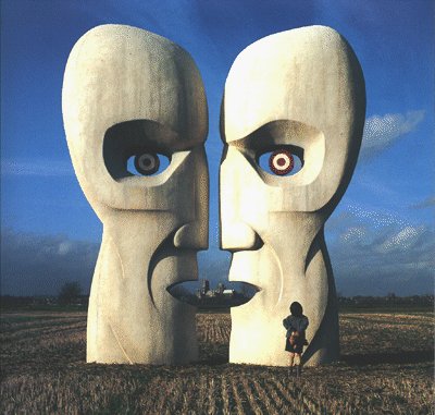
SB: So, getting back to the Division Bell cover. Were you at all involved with the concept and design of the giant heads?
RT: I had no input in the design. The designs were thought up by Storm and Pete Curzon, and are all about communication. The two heads can be seen as one, and the flags/lights/whatever representing communication--I think.
 The Division Bell |
SB: Why were there two sets of heads--one metal and one stone? Was there some 'meaning' in that, or was Storm just afraid that one wouldn't look as good as the other?
RT: I don't know anything about any meaning in stone or metal. I think that Storm probably wanted to be sure he had something that worked (model makers are not always perfect!), and the best way to do this was to have two. In the end, they both worked, though the metal heads were, for me, wonderful.
SB: Any idea why one set was chosen for the US album cover and the other for the UK/European album cover?
RT: I have no idea--probably to give you lot something to think about!
SB: Who actually built the heads?
RT: The metal heads were made by Model Solutions in London, and the stone heads were made by Aiden Heinz. They were carved from expanded polystyrene and covered in a skin of fibreglass which was then finished as you see them.
SB: Wow! Somehow I had always imagined that the metal heads were hollow. And those metal heads weren't actually metal? Just fiberglass made to look like metal? Were the 'rivets' cast in the fiberglass too?
RT: Yes, all plastic, even the rivets. The cost of making them as we did was quite high. It would have been prohibitively expensive and completely impractical to make them out of metal and stone. They would have been impossible to maneuver. We have had many models made in this way over the years, most recently a large flame that was used on the Audioslave CD.
SB: How big were the heads?
RT: They were huge. The mouths are at around head height. They were brought up to Ely on articulated lorries, and held in place with scaffolding, weights, ropes and pegs. Even so, they got blown over a couple of times. As they were only to be viewed from the front, they were only sculpted on that side. The back was built flat with attachments for the scaffolding. They were very heavy--it took ten of us to lift each head. Half-way through the shoot, Storm decided he wanted to move the stone heads 3 miles to the same field as the metal heads and I had to rustle up 10 people out of thin air. A local farmer was very obliging, and came along with several hands and a tractor and trailer (cash is a powerful tool).
SB: Did you have to make any modifications to the heads on site due to lighting, weather, etc?
RT: They were shot pretty much as they came. Some staining was applied, but otherwise, nothing.
SB: How many days did you shoot? What time of year was it? Any idea about why that site was selected?
RT: I found the locations where the heads were put--in the Fens around Ely (that's Ely cathedral in the background to the metal heads) north of Cambridge (resonant with the Floyd). We then spent 3 weeks in January or February with them, living out of a Land Rover, eating and washing in a roadside cafe. We shot them every day, in all lighting conditions--they look so different in different conditions.
SB: How many different 'versions' were photographed? I've seen lots of variations--daylight & nighttime, lights in the background, red flags in the background, nothing but cathedral in the background. Was there any rhyme or reason to this? Or were they just going for as many variables as they could come up with?
RT: We shot in all sorts of lighting conditions, with all sorts of variations, in two locations, with two sets of heads, and so on basically because we would only get one chance to get it right. This also gave Storm and Pete Curzon more flexibility when it came to laying it out. The heads were very difficult to move, so we were loath to move them once they were in place. As I said, the Stone Heads were 2 or 3 miles away at first, with the church at Bluntisham in the background. Bluntisham was selected because it looked good and wasn't too far from our other location--again it gave us more variety.
SB: What became of the heads afterwards? Dismantled? Or packed off to some warehouse?
RT: The heads were put into storage afterwards--one of the band had a large barn full of memorabilia somewhere down a tiny country lane near Henley--great fun navigating that with two articulated lorries! After that they were used in the live shows at Earls Court in London, where they were put on the roof.
There were some small heads made recently--they feature in the Echoes sleeve. They now reside in the window of the retoucher who did all the work on that sleeve--Jason Reddy--near Oxford Street in London.
SB: What other photography for the album did you do?
RT: I did go and shoot some stuff at the radio telescope that is part of Cambridge University, but can't remember what was used.
SB: How about the images of the people walking in the field wearing the enormous cape and scarves? These appear to be stills from the concert film used during "High Hopes". Were you involved in any of that, or the other films produced for the tour?
RT: All these stills were shot by Steve Piotrowski during the filming of the stuff that was to be projected during the concert (Storm directed that, with Tony May as Assistant Director). I wasn't involved in that as I had other commitments and couldn't give the 100% required.
SB: Did you do any of the photography for the PULSE album?
SB: Yes, I shot the beach section along the south coast near Bournemouth.
SB: How about images used to promote the sale of the Floyd's back catalogue? (The Tree of Half Life, the giant armchair in the field, the painted women sitting beside the pool, etc.)
RT: Tony shot the Tree of Half Life and the armchair, though again, I found the location down in Wiltshire, around 75 miles west of London. I found a private pool in southwest London where Tony shot the girls for the back catalogue.
SB: You are also credited with photography for the Is There Anybody Out There album, yet the vast majority of the photos used are from 1980 and 1981. What exactly did you photograph? The Floyd masks?
RT: Yes, I shot the masks for the sleeve. I also drove up to Cambridge and wandered around the colleges for a day shooting brickwork to use as a background for the masks. The album is of live material from 1980-81, so all of the images in the booklets are archive material from the five others credited, who were around at the time. I think I was finishing my Geology degree at the time--little did I know...
 Echoes - The Best of Pink Floyd |
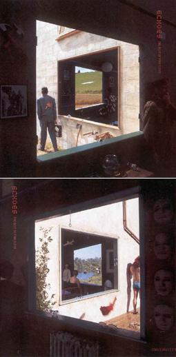
SB: You were also heavily involved in the cover photography for the Echoes - The Best of Pink Floyd project. Please do tell me about that. It seems like a massive undertaking--so many versions with so many minor changes. And so much to coordinate: interior lighting, exterior lighting, costumed subjects, background, etc.
RT: It was quite a complicated undertaking, but pretty straightforward on the day. A large part of the work goes into the preparation. The first thing we did was to make a mock up of it out of 8' x 4' sheets of polystyrene in a studio. This taught us that the windows could not be square, so we made it work in camera, then measured it all out and gave the dimensions to the model makers.
SB: Did the windows have to be trapezoidal too, in order to achieve the proper effect? That's a nice effect--a physical representation of that trapezoid-within-trapezoid design used in the posters and such.
RT: They were trapezoidal, but not regular, and the walls were not at right angles either--very odd how it worked. I'm very glad we tested it all in advance.
The model makers, Hothouse Models and Effects, provided us with a set of flats that were taken on location. I then simulated interiors with drapes and lit as necessary using HMIs. Storm, Peter Curzon, Dan Abbot, and Sam Brooks were all around at various times arranging things under Storm's eye. This left me free to concentrate on the technicalities. We shot in two locations. The first location was on the River Cam in Cambridge. We had one day there, including putting it all together, lighting, shooting and breaking. The second location was on a farm in the South Downs, a ridge of hills along the South coast of England. We went and set the flats up there in the rain, hoping it would clear. At around lunchtime it became clear that it wasn't going to do so, so we left it in position and went home, returning a few days later. We spent a day there repeating what we had done on the Cam. There must have been a crew of around 20 there on each day--you can see us all at work in the shots that Sam Brooks took that were used as backgrounds in the booklet.
SB: Again, why are there so many subtly different versions?
RT: We shot lots of different versions really because we could. The design isn't hard and fast, and is open to interpretation by Storm and the rest of us on the day. If something looks good (and fits in with the idea), we'll put it in. There may be a better arrangement, or maybe someone else would look good in the foreground... these are the kinds of things going through our heads on the day as we explore what we have to work with. It's a labour of love. You have to play with it--try this--what would happen if we did that...
SB: Are you completely happy with the end result? Which were your favorites?
RT: I think the finished result looks great. I have to admit that on paper, I didn't think it would be so good, but it turned out very well. My favourite is on the sleeve. Everything is in the right place--the girl in the foreground, the red rag, the swimmer--all in the right position, combined with the light at this time of day giving nice long shadows on the wall. Great.
SB: My only complaint is that the 'interior' portions of the images are too dark, which makes it hard to decipher what all the elements are.
RT: Well, it gives you something to think about--you don't want it to be too easy do you?
SB: Were you familiar enough with Floyd minutiae to understand all the references in the objects used? Or did the whole thing seem a bit odd?
RT: No it doesn't seem odd at all. I've been working with Storm for around 15 years now--this sort of thing is perfectly normal. Maybe it's a matter of becoming familiar with Storm and the way his mind works, getting to know what he is thinking and how he sees things. We've done this sort of thing countless times now over the years. There is a visual language that pervades all of Storm's work. The more you are involved with it, the easier it becomes to converse in his language. At the end of the day, nearly all his sleeves speak this language--they clearly have his imprint, his stamp on them. They are very much his covers. They are conceived on paper, and more often than not, the end product is a version of that drawing brought to life, from 2-D to 3-D. The designs largely have a strong graphic element (the windows in Echoes, the circular shape in Pulse, the shape of the heads in the Division Bell, the river of beds in Momentary Lapse of Reason). These elements are central to the design, and are fixed elements--they are the core of the picture, on which everything hangs.
SB: Do work with Storm on any of his non-Floyd projects? Which ones?
RT: In the past few years, we've worked on sleeves for Audioslave, Styx, Ethnix, Yumi, Ian Dury, the Cranberries, Catherine Wheel, Blinker, Alan Parsons, Phish, and book jackets for the Douglas Adams Hitch Hiker's Guide series.
We have also done some film work together. It started 5 or 6 years ago, when I went out to the US with Storm to shoot stills on a documentary he was filming about UFOs. I ended up as second camera (see what I mean about flexibility?). I shot the film footage to the "Wish You Were Here" web video. And more recently, we have shot some documentaries to be included on the release of Live at Pompeii and Pulse on DVD. I have in the past couple of years started to explore this medium some more, and have shot a few short films and am currently working on some documentary ideas.
SB: What can you tell us about the documentaries for Pompeii and Pulse? What did you shoot?
RT: I don't know a great deal about this--we shot documentary interviews last summer and autumn, with various people who were connected with the tours in various capacities. We interviewed technicians, engineers, architects, directors, and so on about their involvement in the projects. The documentaries were thought of as a bonus material to add to the film footage of the concerts. I don't know whether or not our documentaries will even be included.
SB: How about Delicate Sound of Thunder? Any chance of seeing that on DVD anytime soon?
RT: I haven't heard anything at all about it.
SB: Are you much of a music fan? What kinds of music do you listen to?
RT: I do love music--it's an important part of my life. I'm not a serious fan though. I currently listen to Coldplay, Moby, Dido, and whatever else takes my fancy.
SB: Do you consider yourself a Pink Floyd fan?
RT: I'm afraid I'm not a great Floyd fan. I did buy Dark Side on vinyl many years ago, but I think my wife threw it out years ago with all those records we weren't listening to (good grounds for divorce there). I do like Dark Side and "Wish You Were Here" (heard it a lot during the making of the web film).
SB Were you a fan of Storm's work for the Floyd prior to your own involvement?
RT: I was a fan of Storm's without realising it--I had Black Sabbath, UFO, Led Zeppelin and the Dark Side sleeve in my record collection, never realising the link!
SB: One last question: in all these years of working on Pink Floyd projects, have you met any of them?
RT: I have met one or two of them in passing--most memorably one of Dave's dogs (McVicar) ripped a hole in my trousers when I delivered the Echoes art work in the role of postman. That amused him.
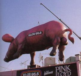
Pigs on the Wing
A look at one of the Floyd's most enduring symbols
In my office at work, I have a pink plastic pig suspended from a string. It has battery-operated wings which allow it, when given a push, to fly in a circle. It was made in China, and although it has no deliberate association with Pink Floyd, it was given to me by someone who hears Pink Floyd music emanating from my office. How did such an odd image, a flying pig, become an icon for one of the world's greatest rock bands?
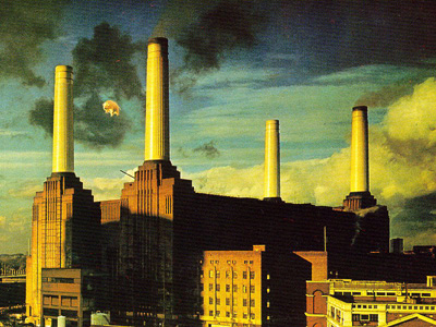 |
It started in 1976. In a recent Mojo Magazine interview, Roger Waters describes how he was dissatisfied with the ideas Storm Thorgerson had proposed for the album cover for Animals. David Gilmour challenged him to come up with something better, so Waters went to the Battersea power station, and had the idea for the inflatable pig. The idea itself isn't all that much of a stretch, given that the band had used a giant inflatable as early as 1971, and Animals begins and ends with "Pigs on the Wing." In 1971, at the May 15 Crystal Palace Garden Party, a 50 foot octopus rose out of the lake in front of the stage. Legend has it that some combination of volume, dry ice, and the giant octopus killed the fish in the lake, which seems almost to predict something going wrong at the launch of the pig some five years later.
Nowadays, an album cover like Animals would probably be created on a computer, but twenty-six years ago, if you wanted a picture of a giant flying pig, you had to build a giant pig and make it fly. Right from the start, however, the pig seemed to have a mind of its own. On December 2, 1976, the 40-foot inflatable pig was scheduled to be launched above Battersea Power Station and photographed for the album cover. A marksman was on hand to bring the pig down if anything went wrong. Something did go wrong--there wasn't enough helium to get the pig airborne, and the launch was postponed by a day. On December 3, there was plenty of helium--but no marksman. The pig broke free of its tether and floated away. A pilot landing at Heathrow reported it, and a general alert was sent out to all pilots that a 40-foot long flying pig was loose over London. It finally landed in Kent, and its legend had begun. Newspapers ran headlines such as, "Pig Ahoy," and, "Watch Out! There's a Flying Pig About!"
When the band played stadiums on the Animals tour in 1977, they brought the pig (and several other inflatable figures) with them. It was one way to fill the space of the enormous venues they were playing. At the end of the Animals set, which opened the show, the pig came out suspended from a cable over the audience, then as it disappeared behind the stage, a second pig with a belly full of propane was released and detonated about 400 feet in the air. Even in the days before fans posted set lists on their web sites right after each show, word of this sight spread (and was perhaps embellished), and concertgoers remembered this fantastic spectacle.
People had come to expect a full show from Pink Floyd: films projected onto a screen, pyrotechnics, lights, and of course the giant pig. The band members themselves did not embrace celebrity (in fact, Gilmour recalls walking back to the hotel among the crowd and not being recognized) so the pig became a logical symbol when people recalled their concert experience. It was only natural that when the band put together their next live show, The Wall, the pig would be trotted out again. It didn't really have any place in the story (and you won't see it in Alan Parker's film of The Wall), but when the band was behind the wall which had been built on stage, just before "Run Like Hell", out came the pig. Most live recordings of The Wall shows can be dated by Waters' comments during the intro to "Run Like Hell", which varied nightly (typical comment: "Do you like our pig? He's not a very nice pig, but he's a big pig").
 The pig returns to promote the 1987 tour. |
The pig probably would have faded into memory after The Wall, but it just kept coming back as though it had a life of its own. When the band toured in 1988 to promote A Momentary Lapse of Reason, the pig returned during "One of These Days". A cynic might suggest that as an obvious symbol of Pink Floyd's earlier reputation for putting on a great visual show, it was natural for the band to bring back the pig to stake their claim to legitimacy without Waters. However, two things had to happen for them to use it: Waters was paid for rights he claimed to some visual images including the pig, and the pig was altered with a rather noticeable gender-defining anatomical addition. In the Delicate Sound of Thunder video, you can clearly see the joy on one fan's face as the pig is trotted out. (Lip-readers will note that his reaction seems to be, "Holy sh*t. It's the f*cking pig!") Those who pay attention to the credits for that concert film will note "Original Pig Concept: R. Waters" scrolls by quickly.
Not to be outdone, and perhaps staking his own claim to his work with Pink Floyd, Waters staged The Wall live in Berlin in 1990. This time the pig was a ghastly green boar with huge teeth. No longer the floating pink piggy bank from the Animals cover, it had become a horrific Gerald Scarfe caricature come to life, threatening to break through the huge wall which filled the stage.
When Pink Floyd toured to promote The Division Bell they brought along a pair of pigs which resembled the one Waters had used in 1990. They stayed to the sides of the stage, rather than floating out over the audience on a cable, and stagehands pulling cables made them dance menacingly. The pig did not appear during Waters' most recent concert tours, but the image is everywhere: on t-shirts, keychains, tour programs, and the cover of the In The Flesh album. It's also there in the Echoes best-of collection artwork.
So what is it about the pig? Partly it's a matter of repetition. It's been used in their live shows going back 25 years now. It's there on album artwork, tour programs, and all manner of merchandise. There's the legendary story of it flying off over London, and fans' memories of how cool it looked overhead or even shining its great big, lighted eyes at them at concerts. The other reason is that the band members themselves haven't pasted their own faces on the front of their albums, so the image of the pig simply floated into that void and become an icon for a band has never shied away from the surreal.